Monday, October 25, 2010

Some Random Stuff

I'm sorry, sorry, sorry this is so late! Here are a couple of exercises I did quite awhile back but just couldn't get them online due to some internet issues I had at home. I have some more random files to add to this...I just need to find it all in my computer. :)

First off, here is a little goblet I did while practicing using the revolve tool. I drew half a curve and revolved it around the y-axis, added a couple textures/colors, and there you have it:


And here is a logo I did for the Texas Historical Association that I am a member of. We publish the Texas Almanac every two years.


The original.


3D logo.


I really should add some shadows...

To make the logo, I traced the blue star in the original with the curves tool, enclosed them, extruded the curves and added color. The white piece in the back is an extruded plane. In all, there are 5 pieces.

Thursday, October 14, 2010

Electromagnetic Submarine


For my model, I decided to make this electromagnetic sub.


I began with a large cylinder, then extruded the front end several times to create the nose. The back was also extruded several times, elongated, then rounded off at the end.


I added a bit more detail on the tail fins just to make it more interesting. More extrusions. :)


The top two sections were also cylinders that I elongated and deleted several faces and edges. You can't tell from the outside, but there are four poles of varying sizes connecting the top two sections to the body of the sub. The blueprint I used was a bit difficult to work off of because it was drawn with perspective, but it came out OK.

I'm also working on a haunted house, but it's not finished quite yet and I want it to be very detailed. Hopefully it will be done by next week. Ciao!

~Becca

Saturday, September 25, 2010

Skysphere Thingy

I'm now learning Maya, and, just to warn you, I have never worked in 3D before, so this should be interesting. For my first assignment, I had to make a sphere with a texture assigned to it.


Dunno why I like stars and stuff so much...


I should've made the background white so that the sphere's edges are visible...not sure how, though. :/


Inside the sphere.


Kind of pixely... I'm sure there's a way to fix that!

Thursday, May 13, 2010

Final Project 2: Leilah w/Rough Sound Design


I forgot to put this up last night. I was so tired, heh heh. Here is the project with sound, though still no music (which I now definitely want to add). The soun design is very rough because I admittedly did it pretty quickly. The star has no sound effect, which it should and is one of the many things I will fix as soon as final exam season is over. I hope you enjoy!

~Becca

Wednesday, May 12, 2010

Final Project: Leilah


Here's my final project. Yes, it has no sound. It was originally meant to be silent, but now I'm thinking it should have sound. I will have to go in and add it from Logic Pro. Anyway, I named it "Leilah" after the girl, which is Arabic for "born in the night." I thought it was pretty.

This project was so much fun to work on, and it took a LONG time. I really wanted to make something pretty to look at, and I think I succeeded (without sounding cocky), though there are many flaws in it as well. I'm not used to editing in After Effects, and I'm not too happy with the length of some of the scenes, but I can always go back to the original files and tweak it to my liking later on. For the sake of getting this thing turned in, here you go!

I have learned so much because of this project. I can't believe at the start of the semester I didn't know anything about After Effects. I may not be a pro yet, but I think I have come a long way. This class has been a blast! Thanks, Ben!!

~Becca

Wednesday, May 5, 2010

Issues with the Puppet Tool

Problem #1:


I don't know what's going on, but every time I use the puppet tool on the girl's eyebrows, then move the eyebrows up and and down, that stupid little outline shows up. The thing is, that outline is NOT THERE. I have "disappeared" all of the other layers looking for what could be overlapping the eyebrows, but there isn't anything there. And this always seems to happen when I use the puppet tool on the eyebrows, then try to move them. It's like there's an invisible layer somewhere that I can't delete.

For this clip it's a bit difficult to catch, but towards the end her eyebrows go up and then to the side as the camera pans down, as if she was looking worried as she looked down. Her eyebrows were not supposed to shift to the side. They were supposed to hold position. Hmm.

Problem #2:


Same problem here. You can really see that outline at the beginning. See how it disappears if I move the eyebrows down?

At first, with Problem #1, I thought that there was an issue because I was using the puppet tool in 3D space with a camera. However, in Problem #2 I didn't use 3D space or a camera or anything. Yet if I delete the puppet pins and just rotate the eyebrows, it's fine. So there is definitely something wrong with the puppet tool. Have any ideas, Ben? Sorry for the trouble!

~Becca

Thursday, April 29, 2010

Final Project Update #3

Some new random images I had to paint in Photoshop:

Hands. We'll see if I actually use all those fingers.


Various views of the hood. That lumpy thing is her sitting down...


An updated version of the girl's clothes. I added a pattern.

Wednesday, April 28, 2010

Final Project Update #2


I have painted a couple backgrounds for my animation in Photoshop. The files are HUGE because I wanted to be able to only use portions of the same painting throughout the animation. I am prepared to take any shortcut. :)

A starry sky.

This is the jpeg file, so its quality isn't as good as the one I will use. And it's huge. It's made of a couple layers: the blue/black layer, which I used the burn tool with the leaf brush selected on a blue square, and then a stars layer. I made little white dots with a soft brush, then went over them in an air brush. I'll have to figure out a way to make them 'twinkle' in After Effects.


Grassy field. Look at it in full view to see the detail.

Again, this is a jpeg so the quality isn't as good, and that sky in the background will be replaced with a piece of the sky canvas I made at the top.

Here you can see some of the grass brushes I made in order to paint it:

And some rocks:
The pieces that make up the girl (you can't see the eyes because they're white, obviously):


And what the girl will look like (roughly):

Today I am working on the dog and random pieces like a couple of hand positions, sleeves, and some different angles of the girl's face. My goal is to get all of the painting stuff done this week so that I have all next week to animate and do special effects, and that weekend add sound fx and maybe some music. Of course, this is the goal and there's always some kind of wrench thrown into the system. We'll see, we'll see...

~Becca

Wednesday, April 21, 2010

Final Project: Update #1

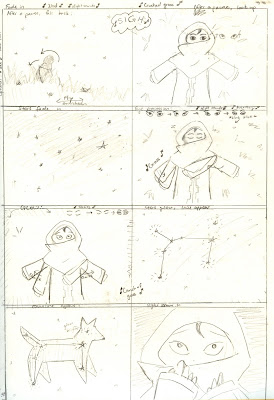
Tada! Storyboards.

Page 1
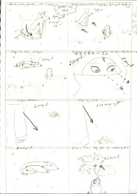
Page 2
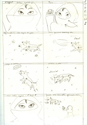
Page 3
...she looks kinda drugged in the second to last panel...
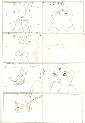
Page 4
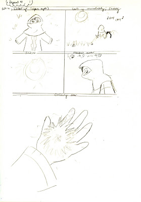
Page 5 Yay for happy endings.

This should have been posted hours ago, but I could NOT for the life of me find a scanner to use/work. (I don't own one.) Needless to say, I finally found one.

My final project is going to be a short animation about a girl and a dog constellation. Sound a little weird? Yes. Yes it is.


Basically, the story goes like this: a little shepherd girl (or something) falls asleep late at night while tending her sheep, when she is awakened by some glowing stars. Suddenly, the very constellation she was looking at only seconds before comes to life as a living dog. (It's Canis Major.) She is a little scared at first, but sees that the dog just wants to play. So she throws a rock for it to catch. Once it hits the sky, the rock turns into a shooting star, and the dog catches it. He returns it to her, but just before he can drop it into her hands, the sun begins to rise. The dog fades away, leaving the little girl very sad. Everything is enveloped in a white light, and the girl wakes up in the same position she had fallen asleep in earlier. Thinking it was just a dream, the girl seems sad, but then notices the glowing star next to her feet, where before it had been just a rock.

There are a lot of little scenes I would like to have added to my storyboards, but I know I need to limit myself so I'll get this done on time. If I do end up having time, I want to add a couple other constellations. For example, when the dog first awakens and keeps barking, I want Pisces (the fish) to awaken, swim around its head to shush him, then fade away again. Or, when the dog is chasing the shooting star, it runs into another constellation, like the bear or cat or something meanish. After being growled at, they disappear, and the dog limps away with its tail between its legs back to the girl. I know all of this would be very difficult to do in the amount of time I have, so that's why I have made it "optional."

So, to follow my storyboards, start from left and go to the right. It may seem confusing because I tend to sketch the previous positions of the characters behind the solid sketches of current positions. That way I have an idea of where I should place the pieces of the characters.

Having said that, I will be using After Effects to puppet the characters, though I'll make their pieces in Photoshop. I'm still trying to decide if I would like to use different textures on different pieces, such as fabric texture on the girl's clothes, or granite on the rocks. The hardest part will be creating the constellation. My idea right now is to outline it in white and fill it with a somewhat transparent layer of stars, just so that there is a little contrast between it and the sky around it.

Now is the time to get to work! :) In the meantime, enjoy some character sketches...

~Becca


Canis Major. The big part of the constellation is the Dog Star, Sirius.

Puppy. I was debating just making up my constellation for awhile there.


This girl was SO HARD to figure out. I knew I wanted some kind of face covering, so I had to do all sorts of research about hijabs, burqas, head scarves, you name it. It was kinda cool, actually. I felt this design was too formal.
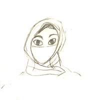
Too ninja.
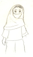
I was reeeeally close to using this one.

There she is! I settled on this design, though I tried to make her look a bit older, like the previous sketch. Hope you enjoyed!


Wednesday, April 14, 2010

Assignment 9: Particle Effects


Something strange is going down on Main Street...


First of all, I need to give Videocopilot.net credit for helping me make this with their wonderful tutorials. (And of course, thank you Ben for teaching me, well, everything!) Between what I learned in class and this website, I have learned a ton more about particles and how they work than had I tried everything on my own.

Here we have some kind of energy tornado thing. It doesn't make sense, but I wanted to make something look kinda cool. I noticed videocopilot.net had a tutorial on energy and decided to try it out.

There are several particle effects in this: the tornado is a 3D layer (with a camera, of course) of twirling tripolygons with a feathered mask over it, there is a circle of tripolygons being sucked into a hole underneath that, there are "trash" particles blowing all over the place (movement of that was randomized), there are layers of "small bubbles" and "large bubbles" at the base of the tornado that utilize a puff of smoke jpeg I found, and the glowing, flickering base of the tornado is made up of two circles with the wiggler added to its opacity. That's right, I used expressions! The final layer is a black mask, which I tampered with the color correction to make the original photo of Taylor, Texas' Main Street look darker and creepier. Finally, I made all the layers into a new composition and added the camera shake (wiggler). Keep in mind, I did color correction ('curves,' to be exact) on virtually all of the layers.

I'm pretty excited about what I was able to do on my first try. My only complaint is that the bubbles didn't come out quite as I had hoped. I really wanted to make this sphere of shifting energy at the base of the tornado, kind of like on the original Terminator. Other than that, I really liked how this one came out. It's kind of creepy!

~Becca

Tuesday, April 6, 2010

Assignment 8: Green Screen Exercise


Wingardium leviosa! A short green screen exercise. Like my oh-so-realistic feather??

WELL, what to say about this... First I used a couple garbage mattes to get rid of the exposed walls around the stage. I used Keylight 1.2 in After Effects to key out the green, soften up the edges, color correct, and a bunch of other things. I tried really hard to get those dang edges to clean up, but it just wasn't going to work. You can see a nasty gray line all along my right side - especially on my pants - and my face was super shiny that day (I guess it was hot...?) and was thus spilling green all over the place. It took me forever to make sure my face wouldn't disappear whenever I turn it. Ah, well. It was my first time. I added a light in After Effects to try and brighten my right side up a bit to match the background a little better. It wasn't till after I uploaded it that I realized that the shadows don't match between the footage and the background. :P And of course YouTube decided to cut off my disappearing act at the end. I really just need to take the time and upload everything on Vimeo!

Enjoy!

~Becca

Wednesday, March 31, 2010

Assignment 7 1/2? Pre-Green Screen

When we filmed last Thursday in front of a green screen, I was the first to go so I didn't really know what I was doing. Luckily we had a little Harry Potter wand so I casted a spell ("Wingardium Leviosa!") in hopes that I will be able to animate a feather or something hovering in the air. Then I casted some kind of shield of invisibility around me (or something) that I will hopefully be able to use particles when we learn those. I had a lot of fun watching everyone else's little skits, especially Ben's fight on a rooftop. I may end up animating that clip instead...

I'm still not quite sure how I would animate the feather realistically, so I may also end up doing a tracking shot like we did in class, in which I'd film something around campus, key out the sky, and put something ginormous in the background, like one of those tripod alien ships from War of the Worlds. Or maybe an oncoming tidal wave. Hmm....So many options....

Anyway, that's what I'm thinking so far! I had never really thought about how difficult it is to film in front of a green screen before last week. There are so many parameters you have to make sure are working correctly before getting a good shot. I have to say, I'm still a big fan of building your own sets, just because it gives the actors and audience something "real" to look at, but a green screen can be sooo helpful. Adios!

~Becca


Tuesday, March 23, 2010

Assignment 7: Text & Talladega Nights


One of my fav quotes from Talladega Nights. I know this movie is stupid, but I love it.

Made this in After Effects. I was surprised I didn't use any presets like I was planning on doing. Instead I just had fun rearranging the text around the screen. The audio clip is from The MovieWavs Page (www.moviewavs.com), which I was highly impressed with. They have a huge database of downloadable audio clips from different movies.

Anyway, I think this project actually took longer than I thought. It was a breeze at first, then I realized that many hours had actually passed... I never realized just how many words people say in such a short amount of time! I had fun doing it, and it was surprisingly easy, so hopefully I'll make more soon!

~Becca

Tuesday, March 9, 2010

Assignment 6: Shadow Puppets


This kid has too strong and disturbed of an imagination.

Or maybe that's just me.

Here I have made a few billboards as you saw from my last entry. The hands and sheet (background) were done in Photoshop and imported into After Effects. I used only one camera to zoom in on the shadows and one spotlight to cast them.

There are a lot of things I want to change about this, but I have run short on time to get the assignment in (my own fault), so I'll submit this and then correct it later this week to my liking. :) I've been out of town since Friday for a grad school interview/program, so, naturally, nothing got done for school this weekend! And I'd do it tomorrow before class but I just got a job (yay!) that I have to work.

But enough of excuses! For the things I would fix: SOUND EFFECTS. I have a folder full of potential sound effects that I really want to play with, like the sound of a kid laughing, dogs barking, birds squawking, and a monster laughing. And a burp. Like I said, once I get enough time I will mix them all in Logic Pro. I also really hate that little jerk the camera does at the beginning when zooming in, but it just takes so long to render out (this one took about 30 minutes, maybe a little more) that I didn't want to sit through it again. Finally, looking at it now, I would like to experiment with making the sheet a bit transparent and adding one or two low key lights behind it, just to add a little realism. Oh, and the shadows need to be darkened. I can see a bit of the edge of the left hand where I had attached it to the arm.

I really enjoyed this assignment and I'm actually pretty pleased with how mine came out. (I had been scared to death of doing something in 3D!) I gave myself nightmares creating that monster hand. It actually looks kind of like a dragon in its shadow form, but if I were to pull the camera back and let you see what the actual hand looks like when its mutated...it's just terrifying.

And for the record, I don't hate children, I promise.

~Becca

Tuesday, March 2, 2010

Assignment 6 1/2: Shadow Puppets

Here is my progress so far in making a short bit in AE called "Shadow Puppets." The idea is with one camera and one light I can show a kid playing with shadow puppets against the backdrop of this sheet here:
Here are some of the hands I'm using. We've got an alligator:

and a dog:
I have already set up the scene in AE, but I haven't recorded any movement yet to show you. You'll have to wait till next week for that!

All of these files were made in Photoshop using the pen, brush and paint bucket tools. I also have versions of them where the hands are actually separated from the arms so that I can animate them separately in AE. My only worry is that the files are too small and will end up pixely when animating them. I'm planning on using the puppet tool on the hands to make them bend. That way the pinky can move on the "dog" so it can bark and the "jaws" of the alligator can move. All you will see is their shadows, so it doesn't really matter how distorted they end up being.

I'm going to try and find some nice sound effects in the UT sound library once again. The dog should be easy enough, but what does an alligator sound like?

~Becca

Wednesday, February 24, 2010


IT SNOWED IN AUSTIN, TEXAS.

I just have to get the word out. Yesterday it snowed on at least three separate occasions, and if you're not from here you won't understand the joy a native Texan feels when that fluffy white stuff falls from the sky. IT'S AWESOME. It inspired me to do a very stark and deceptively simple-looking animation of a boy watching the snow fall outside his fogged-up window. I wanted it to look sort of sketchy, like a drawing, which is why it's only in black and white.

I actually made the window and the animated snow in Flash, simply because (to make a long story short) the Communications building was shut down early yesterday evening and opened late this morning due to snow/weather issues. I don't have AE on my laptop but I did have this, so...yeah.

Anyway, I imported the window and snow into After Effects and created several masks over the windows with varying levels of Feathering. (That's the foggy stuff covering the glass.) The boy was drawn by mouse (ugh) in Photoshop, each body part/article of clothing on a separate layer. I imported the layers into AE and had to reposition everything and parent the limbs together, which was WAY harder than it sounds. I animated the two masks on the lower left windowpane (one is set to add, the other subtract) to change size and shape as the boy's hand goes over them, one in a circular motion, the other from left to right. One of the requirements for the assignment was to add an animated mask wipe, so I had the kid literally wipe away the mask. Aren't I witty?? ...

It's hard to see the mask because everything is white, and if I could go back and change it I would give the sky a different color so you could see the fog effect better. Unfortunately, because I did the window in Flash, I'd have to go back through the whole process again to add the background. Maybe one day I will be able to afford AE...

Now, many of the following effects are there, you just can't see them because they were done for editing purposes. My first problem was the window frame (the cross thing in the middle of the window). I forgot to fill it in with white, and when I added the snow animation in the background you could see the flakes through the frame. I had to go in and animate white paint to cover up the snow bits whenever they pass through the frame... A real pain, but that's what I get for forgetting! I also had to go in and erase a TON of stray black paint that randomly popped up in the window. My laptop's screen isn't exactly clean and new, and I hadn't noticed those issues when I was working on it at home. If you went into the AE file you'd find all sorts of random keyframes where I just had to erase little specks of stuff!

When I can find it, I'm going to add sound effects for when the boy wipes away the window. The Communications department is really good about maintaining a nice sound effects library for students to use, but I couldn't find one for wiping glass. Perhaps Google holds the answer. *shrug*

Well, enjoy! Today it's bright and sunny outside, which is nice, but I sure do love the snow. :)

~Becca

Tuesday, February 16, 2010

Assignment 4: Arwing & Wolfen


I know, I know. Not much different than last time. This time, though, I used "nesting" to make my Skyscape picture shake in the background by turning its layers into a pre-composition and applying the Wiggler effect and Motion Blur to it. I also added a Wolfen to chase my Arwing. You may not be able to tell very well, but I added very slight ease in/ease outs to the ships as they zoom in and off screen. I actually am not too happy with the result (I think it looks a little stilted, especially toward the end there...) but, like I said last time, I'm learning.

Again, sound was done in Logic Pro. I used a combination of F5 and Marchetti sound fx for the Wolfen, and added a few more Harrier and Gnat fx to the Arwing. I also added an avalanche rumble.

Next time I'll do something completely different, I swear! This week was just kind of crazy because I have two midterms in the next two days. :) Happy Mardi Gras!!!

~Becca

Wednesday, February 10, 2010

Assignment 3: Arwing Zoom


An Arwing from Nintendo's Star Fox series zooms off into the distance.

I'm learning After Effects for the FIRST TIME EVER so please don't be too harsh. I'm not going to lie, AE scares the crap out of me. As soon as I open up the interface and see all those little buttons and parameters I automatically go into panic-mode. So I'm still learning...

The ship has both a motion blur and a gaussian blur (however you spell it) applied to it, and I sketched out its motion path. I would've simply manually moved its position, but AE kept making its path curve instead of the straight line I wanted. Another thing I'll have to figure out. You can't really tell, but I manipulated the Arwing's rotation a bit throughout its flight to give it a bit more movement. If I had time to be really nit-picky, I would go back and quicken the Arwing's launch in front of the planet and slow its disappearance into the background a bit more, since that's how movement and depth-perception work in real life...

I wanted to make the background sort of shake using the Wiggler effect just before the ship passes by the camera to give it a little realism, but I'm not quite sure how to do that, yet, since my Skyscape picture was divided into many layers in AE. I'm sure there is a way to group the layers in the program and then apply the same effect to all of them, I just don't know how yet. I also wanted to make the engine glow on and off, but, again, I'm still figuring it all out. :/

The sound effect I created in Logic Pro. It's the combination of a Harrier engine revving, a Gnat flying by overhead, a flanged whoosh noise, and a synthy sort of 'waah'. (It's hard to explain that last one!) The result sounds a little too jettish for me, and, looking back, I should've added a space depth effect so it's delay would've sounded more like the ship was in space. Then again, in real life there is no sound in space, so I guess I can do whatever I want! I had to manipulate the panning and volume of all of those sound fx so that they went from right to left, soft to loud to soft, following the Arwing's flight.

If I had time, I would've made a space battle. Perhaps for my next assignment...?

~Becca

P.S. Sorry for the poor video quality. I had originally posted it on Vimeo, but it's STILL "waiting in line..." I posted it yesterday. I don't know if it's normal for it to take so long (I'm new to Vimeo), but I went ahead and posted it on my YouTube account. So there ya go!

Arwing (c) Nintendo
Arwing picture (c) ZeroBullet

Wednesday, February 3, 2010

Assignment 1: 'Skyscape'

Well, quality is obviously lost when posting Photoshop artwork on your blog, but oh well, it's done! Here is 'Skyscape,' and though it isn't much, it's my first "space art." I really just wanted to try and make a planet on Photoshop, so my first assignment for my Motion Graphics class provided me with a great excuse to finally try it.

For the planet, I used a photograph of some granite, cloned the heck of out it onto a larger canvas, then used the elliptical tool to trim it into a circular shape. Then I applied the 'spherize' distortion effect a few times to make it more...spherical. From there I added several more textures at various levels of color, saturation, and opacities to make the planet's surface not look so much like granite.

I left that alone for a bit and turned my attention to the atmosphere, that glowy part of the planet. I made three layers of three circles, the bottom one a base color, the middle the atmosphere, and the top the shadow. I added an inner glow, outer glow, and inner shadow to the atmosphere as well as its bluish color, then set the layer to screen. The planet's shadow has a gaussian blur added to it at 100 points, then I moved it underneath the atmosphere level. I stretched the shadow really big to give a softer sort of blur across the upper left of the planet. As a result, though, I had to give the shadow layer a mask and 'erase' all of the extra shadow hanging off the lower right end of the circle so it wouldn't interfere with the sky I would be putting behind it. (Don't worry, Ben, when I say 'erase' I mean I painted over what I wanted gone...or whatever the technical terminology is!) It was a pain, and I'm sure there is a smarter way of going about getting rid of it...someone let me know. Finally I applied the original planet's surface texture above the base color layer and below the shadow and atmosphere layers.

The starry background is simply made up of monochromatic noise (which I tweaked so the stars wouldn't look so uniform) with a colored layer over it at 50% opacity. The space dust is a composite of various keyed-out photos of clouds with varying levels of opacity. It looked a lot nicer at its full resolution. At this size, the space clouds look a little too messy for my liking

Anyway, I enjoyed finally making a planet. I really wanted to make this into a Firefly tribute and add Serenity in there somewhere but I ran out of time. I just finished the TV series (I know, I'm like 5 years late or whatever) and I am oh so sad it's over. :( Anyway, like I said, this is my first space art so I'm sorry it looks amatuerish. Practice makes perfect! I'll just have to make a few solar systems to get really good. :)

~Becca

Friday, January 22, 2010

Introduction


¡Hola!

My name is Becca and I am a Radio-Television-Film and History major at the University of Texas at Austin. I graduate this May! Yaaay! I'm still not really sure what I want to do once I'm out of school, but, lucky for me, the economy will be dictating anything I do in the future, so I suppose I don't have to decide for myself for now...

I love to draw, write, and play the piano and saxophone. I have been involved in band, both marching and concert, since junior high. I love animation, and I was fortunate enough to be able to attend the UT Hollywood Showcase in LA last September. It gave me the chance to see some really wonderful talent from UT on the big screen! Thank you, RTF Department, for letting me go.

I also love movies (obviously) and video games. I adore Miyazaki films, musicals (lame, I know and I don't care!), and old movies from the 1930s and '40s. I enjoy screenwriting, though I haven't been tending to it as much as I used to.

A new dream of mine is to write video games. I feel like its an aspect of the industry that's only just now becoming really important. As games become more complex, more complex storylines are needed. (Complex doesn't necessarily mean good, though. I'm talking to you, Medal Gear Solid!) I'm one of those people, though, that takes FOREVER to beat a game. I tend to talk to every NPC, steal everyone's crap from their houses, and check out every detail of the levels. The developers went through the trouble and time in making those things, so isn't it only right to appreciate them...? *shrug*

Anyway, right now I am in Ben Bays' Motion Graphics class, and this blog will be used primarily to submit my assignments. I'm sorry if they suck. I'm still learning. Also, I'm sorry if I talk too much. I'm new to this whole 'blogging' thing. You young people and your technology...

~Becca